Ask anyone on a finance team what the week before a quarterly business review looks like, and you’ll get some version of the same story. Revenue numbers get pulled from the ERP, cross-checked against whatever BI tool the team uses that month, dropped into last quarter’s slide template, and the narrative gets written on Sunday night because the final figures only settled that afternoon. None of this is difficult work. It’s slow, repetitive, and it pulls your most experienced finance people away from the analysis the QBR is actually supposed to be about.
AskEnola’s workflow automation starts from a different premise: a CFO or finance lead types one sentence describing what they need, and within a handful of exchanges, a complete QBR comes back, charts, data tables, narrative, and all. Here’s what that process actually looks like, walked through using a real QBR generated inside AskEnola.
A workflow library, not a report template
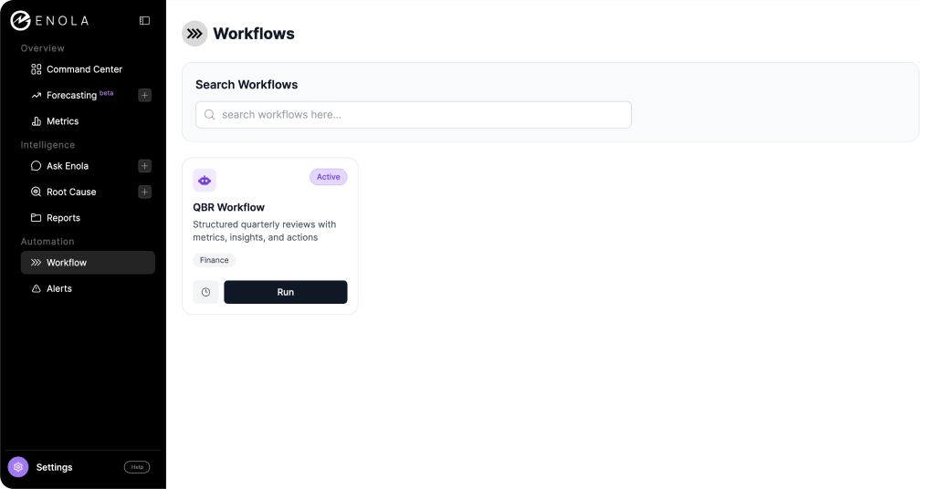
Inside AskEnola, workflows live in their own section of the platform. Each workflow is a packaged, repeatable process built for a specific function and a specific outcome. The one relevant here is labeled simply “QBR Workflow,” tagged for Finance, with a description that promises “structured quarterly reviews with metrics, insights, and actions.”
The distinction matters because most things that call themselves report automation are really templates with variables. You fill in a form, the system swaps in numbers, and you get a document that looks like the last one. A workflow in AskEnola behaves differently. Clicking “Run” doesn’t open a form, it opens a conversation. The system already knows what a QBR generally needs to contain, but it asks you what’s specific to your team, your priorities, and your data before it builds anything.
The conversation behind the QBR
The exchange starts as plainly as you’d expect. The user types “want to create a QBR for Q4 of 2024,” and Enola responds by asking which function the review is for, offering Sales, Product, Finance, and Operations as examples. Once the user answers “Finance,” Enola asks the question that actually shapes everything downstream: what’s the primary metric this QBR should anchor to? It offers revenue, profit, and cost reduction as starting points, and explicitly invites the user to name a few candidates if they’re not sure, rather than forcing a single choice up front.
The user comes back with all three: revenue, profit, and cost reduction. This is where the workflow does something most reporting tools skip entirely.
Instead of assuming all three metrics are equally available, Enola checks them against the underlying data model and reports back honestly. Revenue maps cleanly to a validated field, the sum of sales amounts in the internet sales fact table. Profit and cost reduction don’t have a direct equivalent anywhere in the metadata, and Enola says so, flagging both as data gaps and offering to discuss proxy measures if the user wants to go that route.
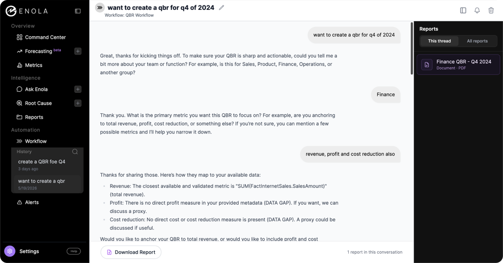
Rather than stall the process waiting for a perfect answer, Enola asks one more clarifying question: anchor the whole QBR to revenue alone, or build it around all three metrics while treating the two gaps as a visible part of the story. The user’s response is about as low-effort as it gets: “Do your best.” From there, Enola returns a full ten-slide structure on its own, complete with a title and agenda, an executive summary, a revenue deep dive, sections for wins and misses, dedicated slides for the profit and cost reduction gaps, a forward-looking section, a leadership ask, and an appendix detailing exactly what data is missing and what it would take to close that gap. A few minutes later, a finished PDF, “Finance QBR – Q4 2024,” appears in the Reports panel alongside the conversation, ready to download.
The entire interaction took two short messages from the user. Everything else, the metric mapping, the gap analysis, the slide architecture, and the document itself, came from the workflow.
What comes back: a deck your team would actually present
The output isn’t a wall of AI-generated paragraphs. It’s a branded, slide-by-slide PDF that reads like something a finance team built for a leadership meeting, because structurally, it is one.
The executive summary leads with the headline number: Q4 2024 total revenue came in at $1.70M, down 16.7% from $2.04M in the same quarter a year earlier. Rather than burying that decline, the summary frames it directly, attributing the drop to softness across key segments and the absence of new major revenue streams, while also calling out that the flagship Mountain-200 product line held up, with multiple variants each clearing $135K.

The revenue performance section backs that summary with a monthly trend chart and a full data table comparing the current period against the prior year, month by month. October and November both came in well below their prior-year equivalents, at $535K and $538K against $708K and $661K, before December rebounded to $625K, still short of last year’s $669K. The Key Wins section then breaks out the top three products by revenue, led by Mountain-200 Silver at $156K, alongside a pie chart of revenue share. Key Misses does the same in reverse, surfacing the two lowest-performing SKUs (a patch kit and a tire tube, each generating under $10 for the quarter) as a prompt to revisit inventory and resource allocation.
None of this required a finance analyst to build a chart, format a table, or write a single sentence of commentary. It came out of a two-message conversation.
The slides that matter most for a CFO: how the gaps get handled
This is the part of the report that’s easy to miss on a first read, and it’s the part that actually distinguishes this from a generic AI report generator.
Pages six and seven of the deck are dedicated entirely to the two metrics Enola flagged at the start: profit and cost reduction. Each one is labeled plainly as a “Data Gap.” The profit slide states directly that profit analysis wasn’t possible this quarter because there’s no line-of-business profit tracking in the available data, and that this limits the team’s ability to assess profitability or prioritize margin work. The cost reduction slide makes the equivalent point: without tracked cost data by line of business, there’s no way to identify operational efficiencies or measure savings over time. Both slides end with a note that the content is qualitative, because the underlying metric simply doesn’t exist yet.


That honesty carries through to the final two sections. The “Ask / Decision Needed” slide turns those gaps into a concrete leadership request, seeking endorsement to implement profit and cost data instrumentation so future quarters can be measured properly. The appendix goes further still, laying out next steps: defining measurement methodologies, adjusting the data infrastructure, and building reporting templates, with a note that this will require Finance, IT, and line-of-business leaders working together.
Most automated reporting tools handle missing data one of two ways. They either fabricate a plausible-looking number to fill the slide, which is how confidently wrong dashboards happen, or they quietly drop the topic, which means nobody downstream ever finds out the data was missing in the first place. Enola does neither. It treats the absence of a metric as a finding in its own right, explains why it matters, and writes it into the narrative as something leadership needs to act on. For a CFO, that turns the QBR from a status update into a tool for making the case for better data infrastructure, with the report itself serving as the evidence.
What this changes about the QBR cycle
The time savings are the obvious headline. What took a finance team days of pulling, reconciling, and formatting now starts from a two-message conversation and a few minutes of processing. But the bigger shift is consistency. Because the metric definitions and slide structure come from the workflow rather than from whoever happens to be building the deck that quarter, every QBR built this way uses the same revenue definition, the same comparison periods, and the same structure. That’s what makes quarter-over-quarter comparisons actually mean something, rather than each deck being a fresh reconstruction with its own quiet assumptions baked in.
There’s also an audit trail built into the process itself. Every report generated through a workflow lands in the Reports panel, viewable either within that specific conversation thread or across all reports generated for the account. If a board member asks where a number came from six months later, the answer isn’t “let me check with the analyst who built that deck.” It’s a documented field in a query, generated by the same workflow that’s still running today.
QBR is one workflow in a larger library
The QBR workflow sits inside a broader automation layer that follows the same conversational model. The same sidebar that houses Workflows also points to Forecasting, Root Cause analysis, and Alerts, each designed around the same idea: describe what you need in plain language, and let the system handle the mechanics of pulling, structuring, and presenting the data. The shift away from static dashboards toward on-demand, conversational analysis isn’t limited to quarterly reporting. It’s the same underlying approach applied to a wider set of recurring finance tasks.
See it on your own numbers
The fastest way to evaluate any of this is to run it against your own data rather than a demo dataset. If you’re curious what your own Q4 (or any quarter) looks like as a QBR built this way, including an honest look at where your own reporting has gaps, AskEnola’s team can walk you through it on a live call, or set you up to try the QBR workflow directly on your connected data.
Book yourself a demo here, or just get a free trial.